In the previous article, we anticipated the big graphic change that Trakti is ready to publish. Below I will explain the process of creating the company logo: a long and demanding path that has led to a great result.
Happy reading.
The design phases of creating a logo, introduced in the last article are many and all extremely important.
The briefing
The first phase of designing a logo and one of the most important of the whole process is the briefing. In this phase, the graphic designer discusses with the client to understand and define the objectives of the project. Usually, the designer asks questions to his client to understand the company’s objectives, mission, and vision, to understand the motivation for a stylistic change, the customer’s expectations and to define the development of a new logo.
At this stage, it is important to gather as much information as possible.
The Briefing phase carried out with Luigi Telesca, Co-Founder and CEO of Trakti, was useful and necessary to understand the product, comprehend the diversified target to which it refers, and above all to define the company’s objectives and Luigi’s expectations: a simple and modern, updated, and recognizable logo. We decided that the orange color should also be included in the new logo to recall the previous logo and that there should be a link with the Italian company Exrade, part of Trakti.
Research
In this phase, I collected more information about the product and then proceeded with the next research step, where I concretized and enriched the information received through an analysis of the reference market and competitors.
Brainstorming
Brainstorming is the phase where creativity starts.
It is a decision-making methodology in which the search for the solution is carried out by writing ideas and thoughts expressed freely and without judgment.
Starting from an initial word, in this specific case “Trakti”, I wrote on a blank sheet few words, small sketches, and thoughts to generate an idea for its new logo.
In the realization of the mood board, I paid attention to abstract concepts, such as “automation”, “innovation”, “future”, and “speed” which led to the creation of ideas for the next phase.
Sketch (or sketches)
Once the ideas were reported on paper, I moved on to the actual creation phase, where a word, an idea, or a concept, turn into a sketch. This step was very long and intense, as abstract concepts, such as “automation”, “innovation”, and “digitalisation” were difficult to transform into more abstract concepts.
After several pages of drafts and sketches, I took the work to the computer.
Proposals and Feedback
The best ideas realized in the sketching phase were brought to vector, or to the computer, where they were worked and re-defined using graphic programs, such as Adobe Illustrator.
After a careful selection of the various sketches, I decided to prepare 5 different proposals to be presented to Luigi. I then held a meeting with him where the “chosen” logo to work on was agreed.
Final delivery

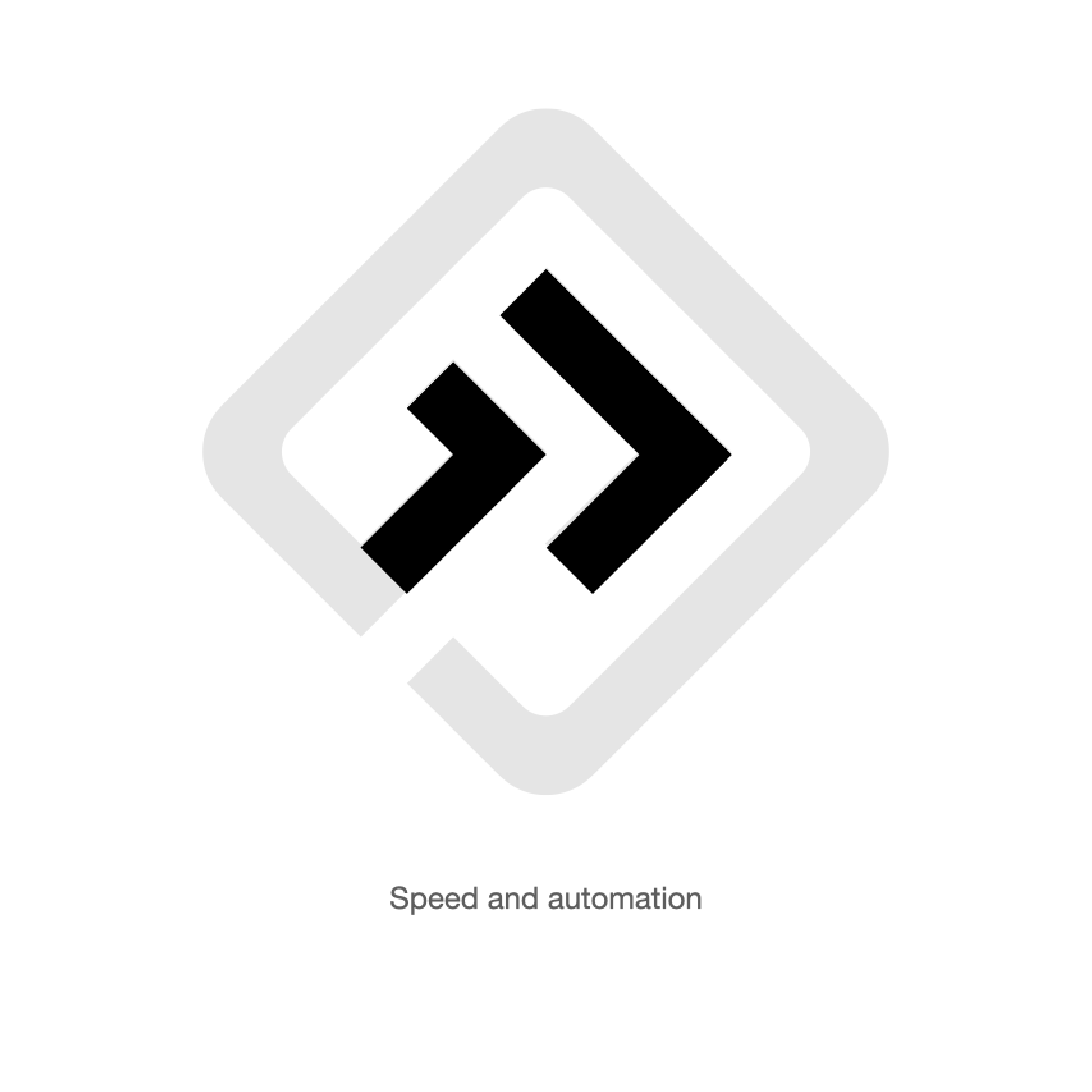
The chosen logo brings with it the characteristics of speed and automation that we discussed with Luigi from the beginning.
Using clean lines both in the pictogram and in the chosen font, Urbanist, in serial variation Medium, result in a modern and minimal logo.
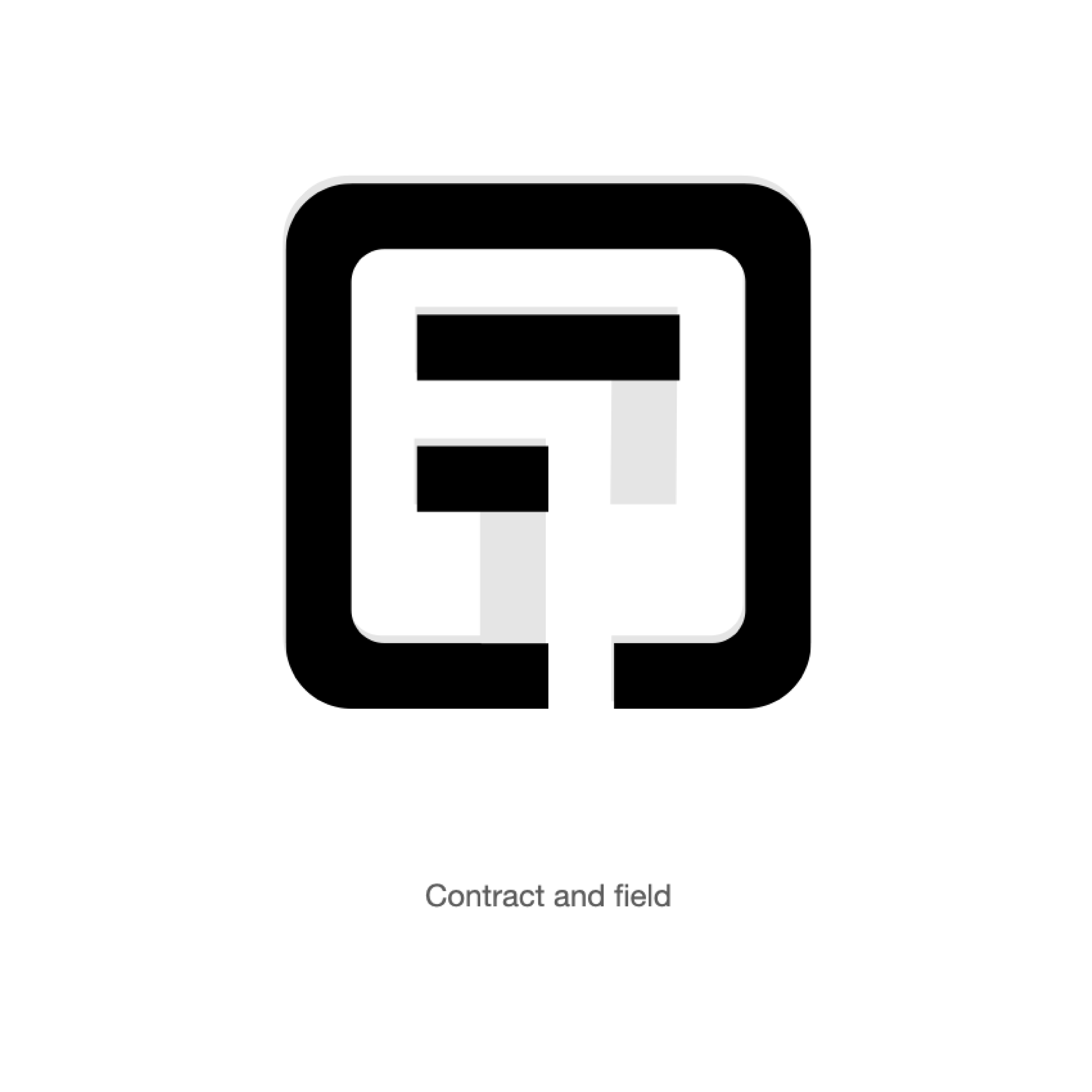
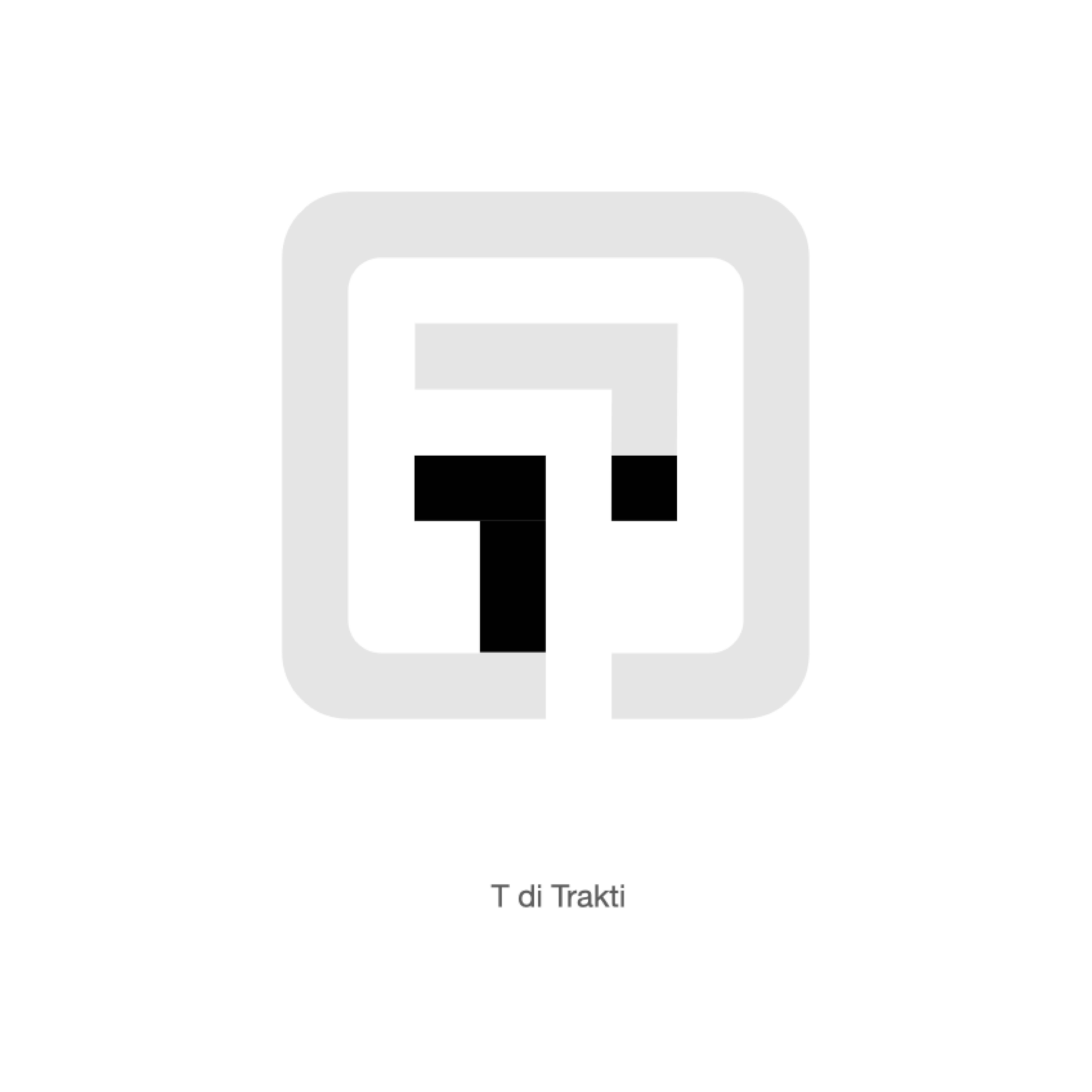
The logo consists of the basic principles of the Trakti platform: the decay of the traditional contract that gives way to a digital contract with simple and effective filling fields. Automation, process, and speed are represented by two arrows pointing to the right. Inside the logo is visible the letter T of Trakti.

The choice of color was important: the bright orange typical of Trakti gives way to a bright purple, the color of metamorphosis and transition and, together with blue, widely used in the tech field. Orange is not abandoned by the whole, but from the primary color that it was previously, it became the secondary color of the logo.
Once the final logo was realized, I created its declinations: the version with the slogan: “Deals Made Easy”, which together with Luigi we deliberately decided to keep, even on the new one and the vertical version.
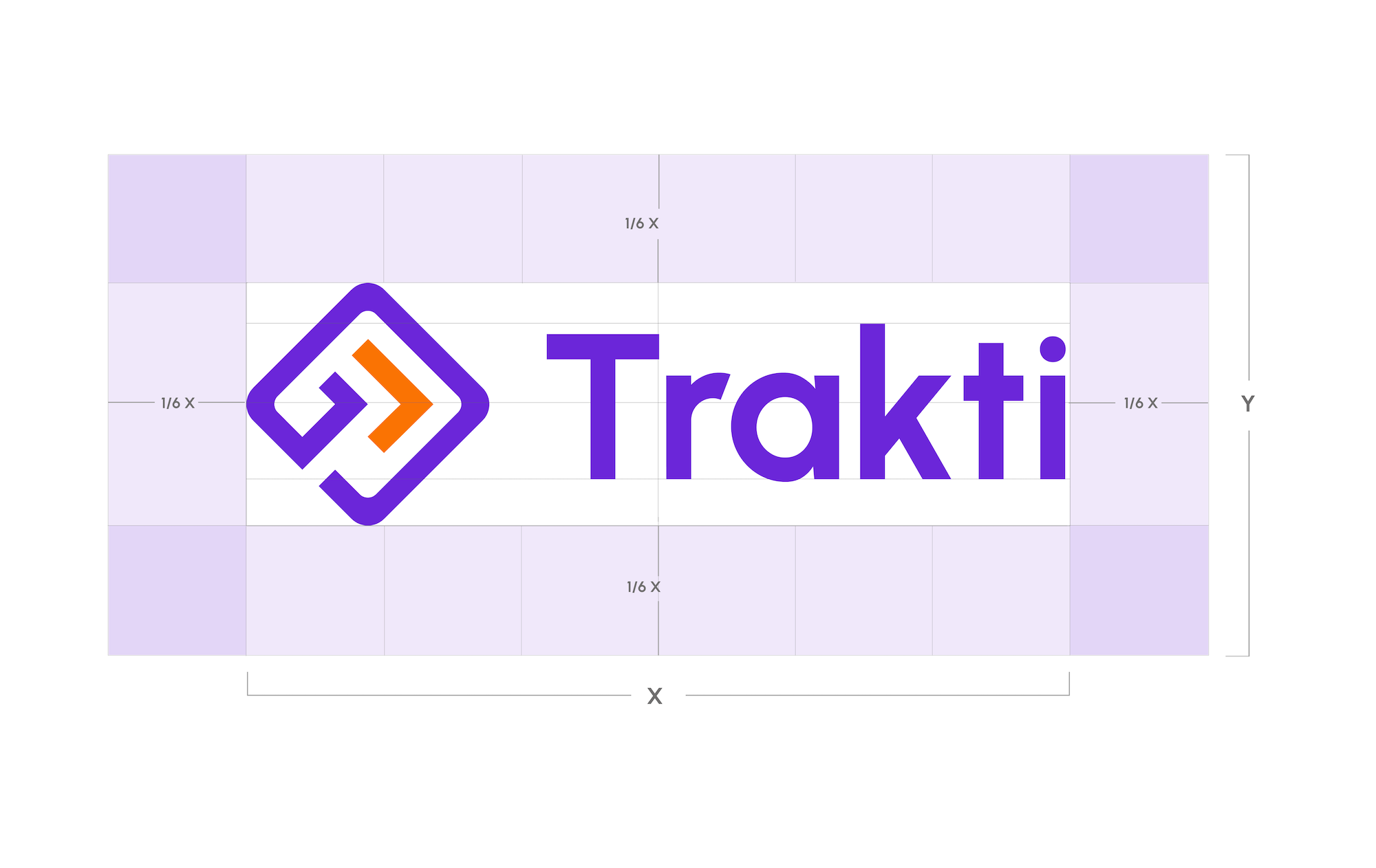
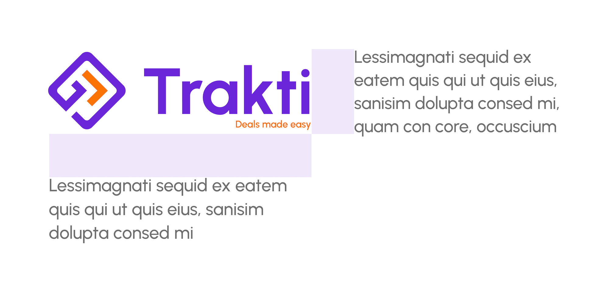
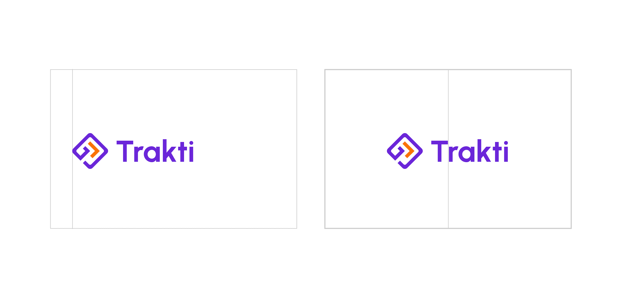
Subsequently, I refined the project, defining the construction lines, the margins of respect, the alignments and the minimum dimensions.
To conclude I made mockups of the subsequent branding work, of which you will see a hint on our site.